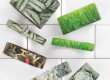
Brizzolari ribbon: an idea is born…
Behind every single Brizzolari ribbon is a creative idea, a feeling, and an image that will lead to the finished product that you will find in our catalogue. Here are the images that illustrate the whole story behind one of our products for 2017 – shabby ribbon. “Shabby” is a concept inspired by furnishings, fashions and design, and we started out with the textured sensations of wooden furniture in this style (but with a touch of chic!). The workmanship behind shabby furniture involves ageing and pretty styles: it comes from the imagination of women who have decorated their own kitchens, dining rooms and bedrooms using tools that are often improvised, and colours made using simple, natural pigments. The result is shabby style, which means simple, almost neglected but still totally cute and charming. When we got the idea to base our new Brizzolari ribbon on shabby style, we passed the concept on to a designer, who started creating sketches we could use to choose the item that best reflected the finished appearance that the ribbon would have to have. Once the sketch had been chosen and the system put in place, it was time to pass on to the prototype, bringing us closer to the finished ribbon itself!
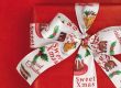
…that becomes a top-quality product!
For Brizzolari shabby ribbon, we decided to print a dark colour on a pale background to accentuate the contrasts – just like on shabby wooden furniture, where the piece to be decorated is painted and then paint is scratched away to expose the light-coloured wood underneath. In the same way, the light-coloured ribbon is printed with a dark colour and then the decoration is brought out by “scratching off” the paint with an embosser. With the same inspiration, based on the wood decorations, we opted to use a simple, repeated geometric pattern, creating a wave effect. It is the very same type of decoration that is a favourite in shabby style! To get the best results, we developed a special palette that would include all of the colours inspired by this world: a dusty pale blue reminiscent of antique decorations; a soft pink with a romantic flavour; coral red that adds brightness but is still a perfect vintage shade, and dove grey, one of the most neutral and relaxing tones ever. The base is ivory, one of the most poetic “neutrals” there is. And here is the stunning finished result! An absolute gem, ready to enhance your gift wrapping with a dreamy, romantic air and just perfect for a host of special occasions.